These thoughts are based on my own openion, so if you have different idea or comment, feel free to add it as a comment to the post.
Chesterfield Ad 1940′s
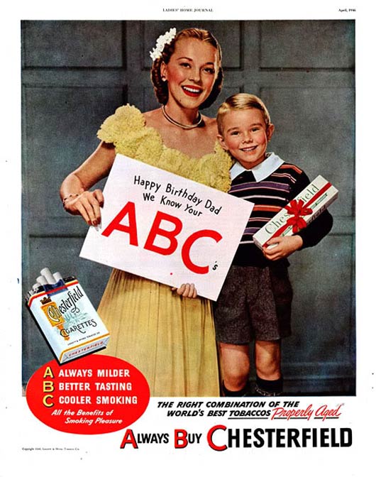
Actually, I never smoke, but I alway follow the old cigarette ads that used to see every where. These ads were used to focus on the need to be special and its messages were taking the style of the special product when it is available for every one. Also, the cigarettes ads were trying to deliver the idea of this product will make you special or it is one of the most important characteristics of the special person.
vintage green chevy ad..
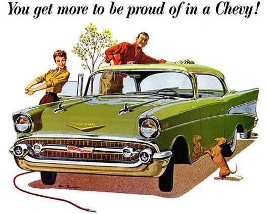
Who do not like classic cars? it was always special either in ads or in the real life. Classic cars were focusing in other aspects of luxury such as alot of metal, alot of details and bigger cars. These concept in luxury has changed completely with the industrial revolution and the always need to be economic, speed and consequently the safety issues. This idea was reflected on ads as well such as the one above.
Chrysler Ad, 1955
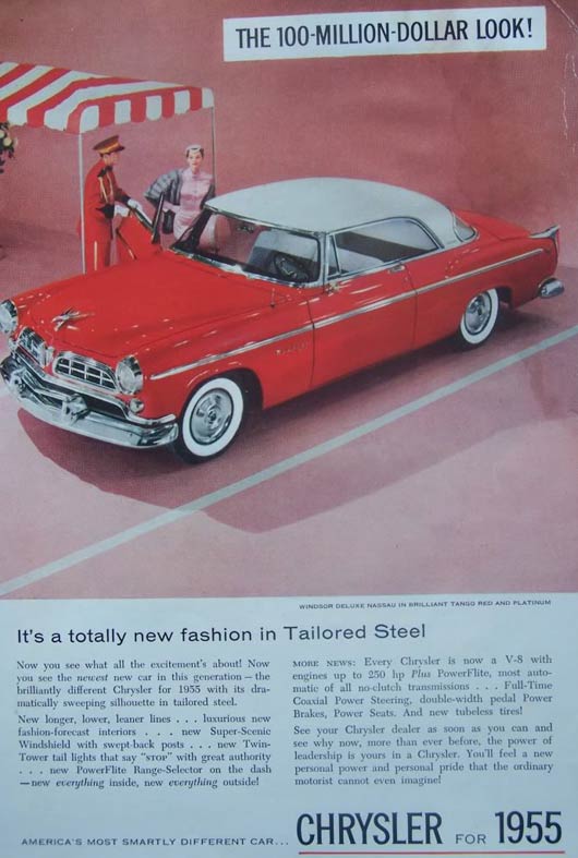
Once can not be wrong that riding such a car worth 100-million-dollar look. Chrysler is one of the marques that kept on its own style in addressing the high level customers that intend to pay for a Chrysler.
Hanes Hosiery Ad
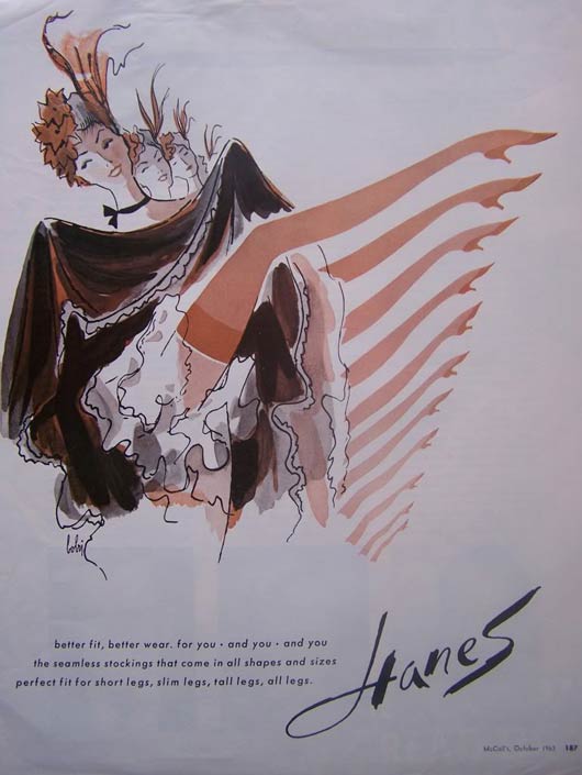
This ad is just a women stockings ad, but it shows an amazing style of creativity. Actually, it represent a new style of art, which frees your illustrations from outlines and use the fill color and shades to show your shape. The ideas of the old american girls dancing the showing their stockings was great to deliver the idea.
Buick Ad
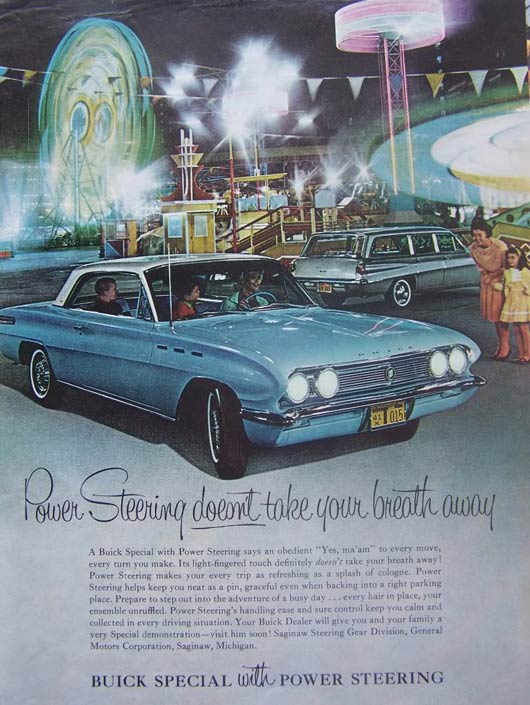
Actually, I never imagine to see a power steering option in such a classic car, but this one is presented by Buick. The most amazing in this ad is the really attractive artwork and good focus on the car and its feature by showing a woman driving it easily. In this ad and the other ads, I always notice that there is alot of text, may be because it is a magazine ad, but actually it is always noticeable that old ads used to have more text and direct message comparing with the recent ads. I refer this to that people were not used to direct messages these days.
Jet-Smooth Chevy01
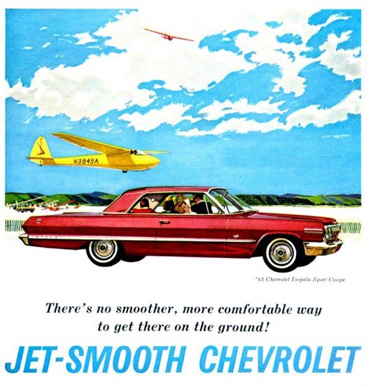
Jet-Smooth Chevrolet02
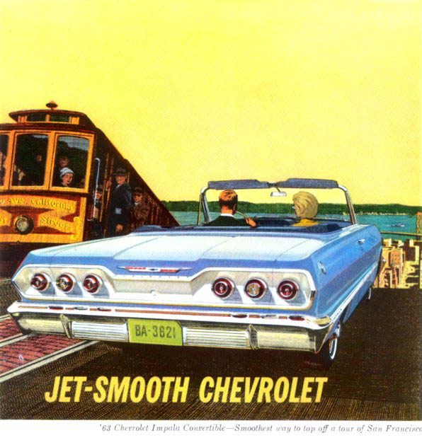
Jet-Smooth Chevy03
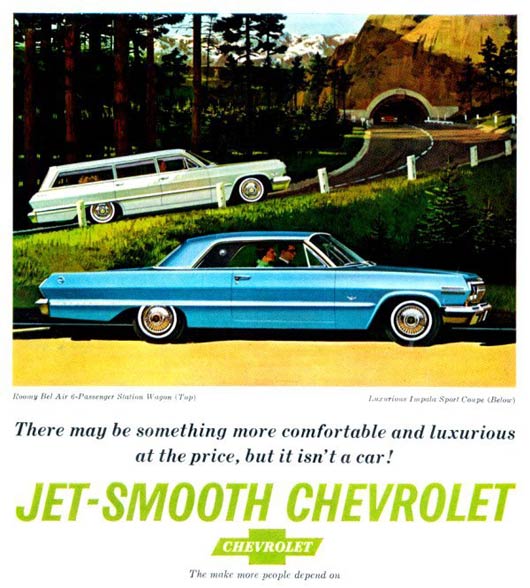
I wonder how fast was this car was!! These 3 chevy ads starts to address a new luxury feature in the car, which is the speed. I assume it is in the more recent period of time than the other ads we saw above.
Vintage Coke ad
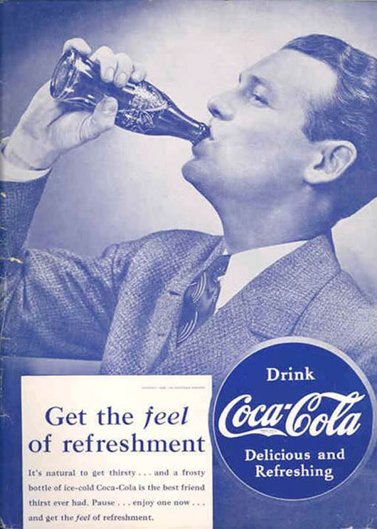
This ad shows the idea of direct messaging I mentioned above, this old Coca-Cola ad tells you directly through the many text and the model to drink this product. You can also notice the very basic apply to the UI concept in the design by providing a big space to show the model while drinking Coca, showing the logo big and clear and showing the slogan big while adding the small text under it.
63 Dodge Ad
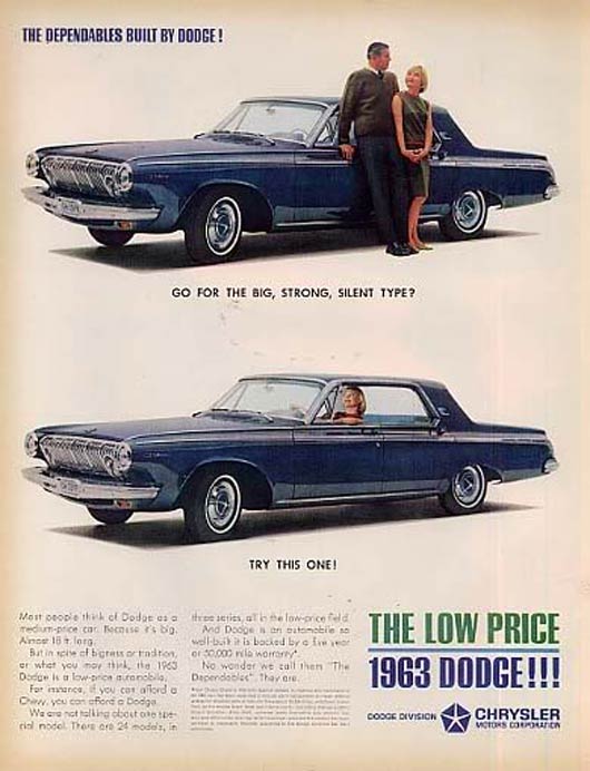
It is the first time in this post to see an advertising with an indirect message, Dodge in this ad lets the girl choose the big, strong and silent choice, which is the car of course ;)
1951 Cadillac Ad
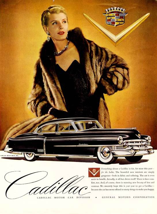
Cadillac in this ad addressed the high level customers by adding the such a classy model with expensive clothings. The big, black and cadillac car worth alot, this is the first impression I got from the ad.
Aries Camer Ad
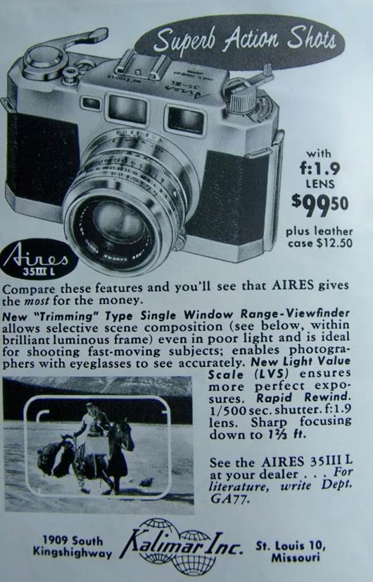
It was very amazing to find this ad
Being Good Coca Cola Santa ad
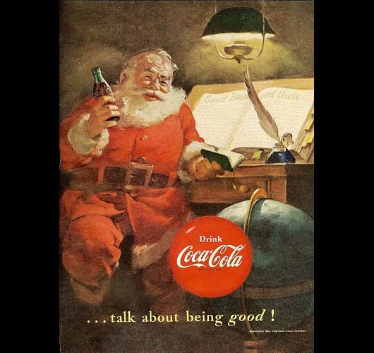
vintage coke ad..
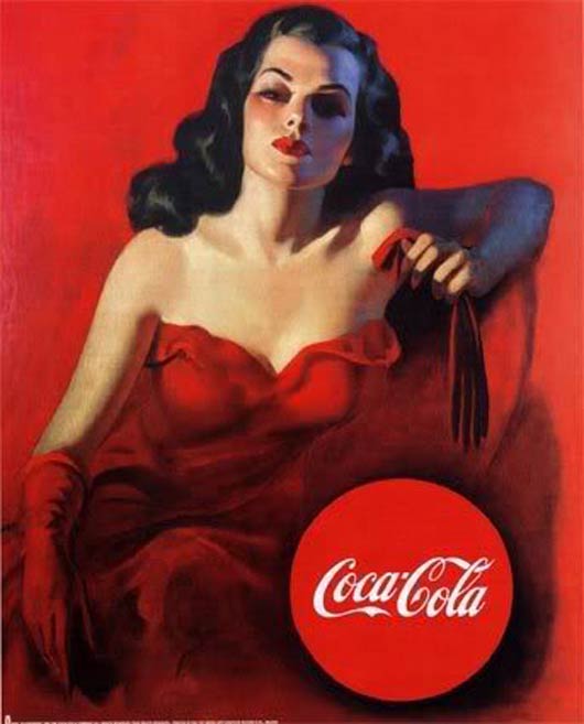
These two ads about Coca-Cola show that this product does not have specific message to address to customers, but it has a wide range of customers that send to each category a special message.
Hertz Rent-A-Car Ad
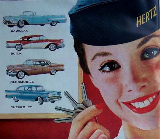
Using the model with the big pretty smile to attract customers was always a common method to deliver the idea or grap the attention to the product itself.k
Vintage Advertisement for sponsor of 1940’s Superman radio program, Kellog’s Pep
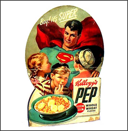
using the kids heroes and movie heroes were always a common method to deliver the attention or address the customer the message through these heroes as we see in this ad.
Kodak Medalist II Camera Ad
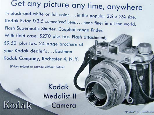
When I saw this ad, I jumped to say: “you must be kidding me. Is this a small camera, I thought it is a SLR!!”. But I notice that the design put the Kodak logo has been added to the bottom left instead of the top.
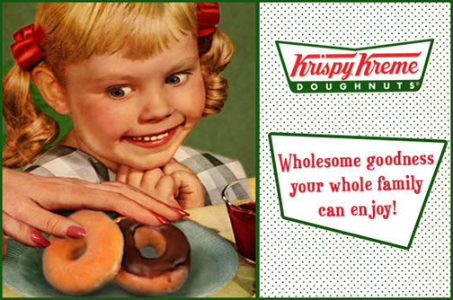
krispy kreme ad..
A Sony ad from the sixties
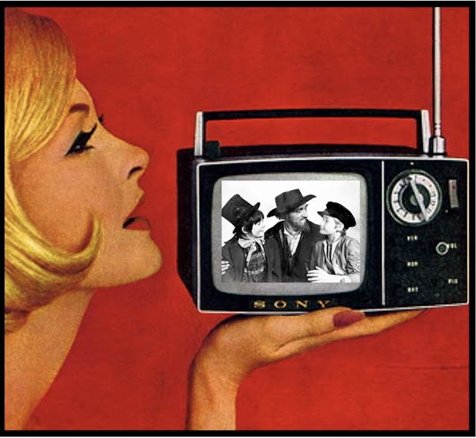
Another ad with using the pretty model to get the customer focus to the product.
Retro vintage tv family ad happiness
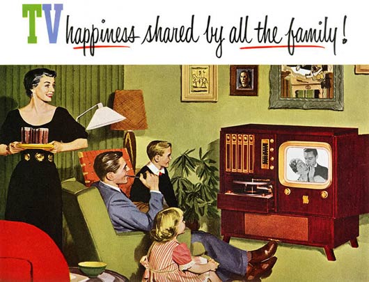
In this TV device ad, the creative direction aimed to focus on how the TV is a reason or a method to collect the family, although recently some openions say that TV make family miss the communication between each other as they focus on the TV.
Ronson Lighters. 1950
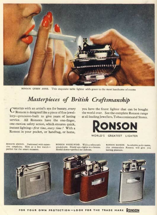
Along with the cigarettes ads, lighters was having its place too. This famous Ronson was used to seen in te old days. The ad focused on the best piece in the Ronoson collection.
Vintage ad for the ship
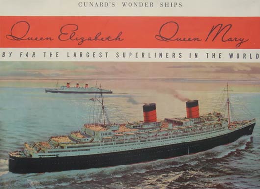
In this ad, it is meant to show the great look for the ship and what`s behind this beauty of luxury. You can notice that the red color that is used to give the ship the royal look and feel.
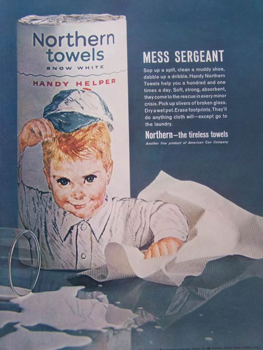
Northern Paper Towels Ad 1
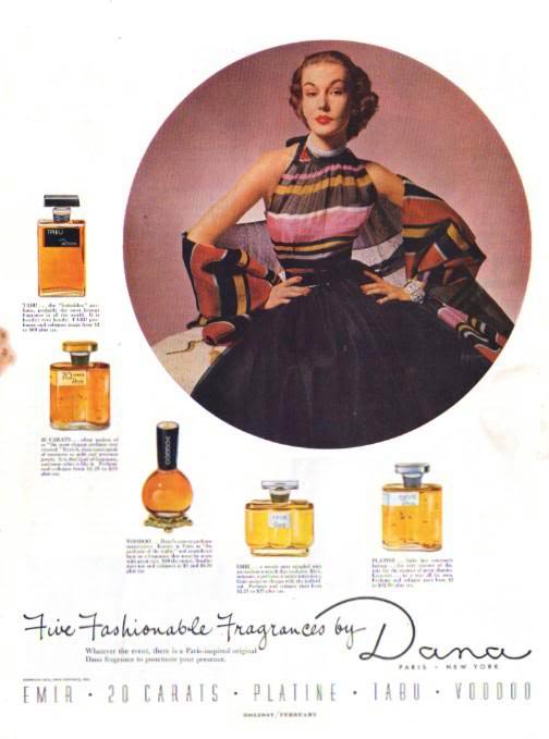
1952 Dana Ad
1953 Ad
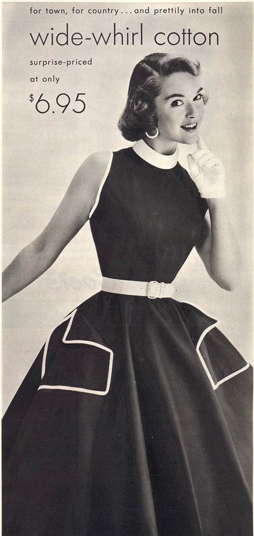
Smoke Camels
This one of the ads that first try to deliver the message about save smoking by mentioning that is used by dotors as well.CJSW vintage radio ad
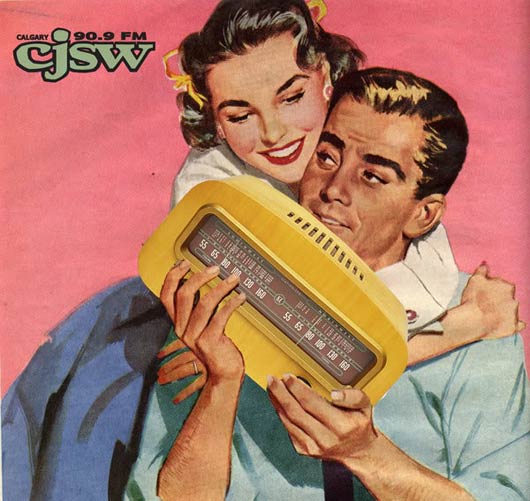
I do not know if this very small radio really makes the man that much attractive, but I think the design means that this device is a good choice to start a dancing party
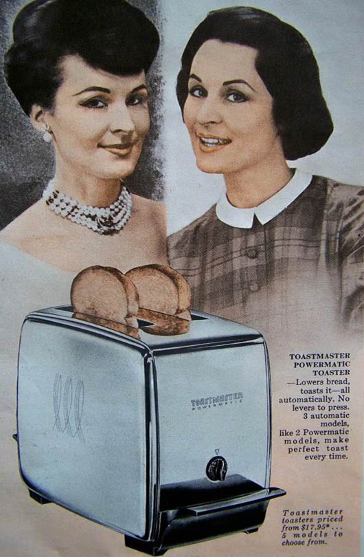
Toaster Ad
Vintage coke ad
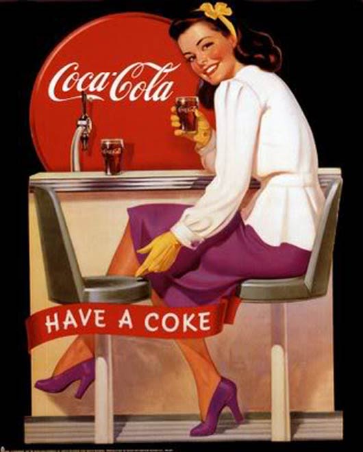
Another ad for Coca-Cloa with totally different appraoch than the above ads.
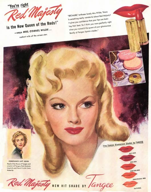
1940′s Lipstick Ad
vintage Avon ad
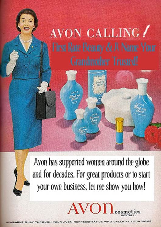
Cosmetics ads were always using the same concept, I always notice the poduct and a pretty model using it, but these classic ads also inlcude alot of text inside it.
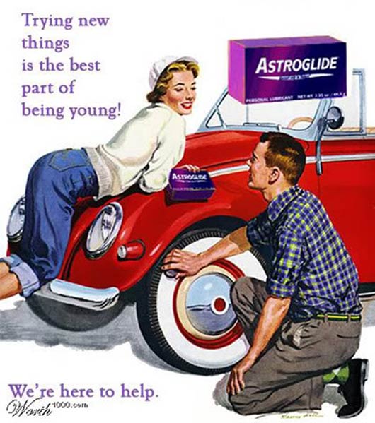
Glide
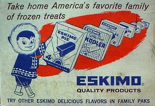
Vintage Eskimo pie ad
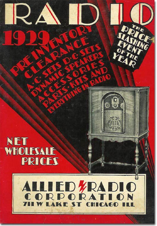
Radio Vintage ad


0 comments:
Post a Comment