
* Things are a bit hectic for me at this time so, as you may have noticed, new posts will be intermittent (depending on my schedule). Sorry for that... I should be able to get back to a stable schedule in a week or two. ~ Leif
About a year ago I posted some examples of 1950s album cover art by a Chicago illustrator named Fred Steffen...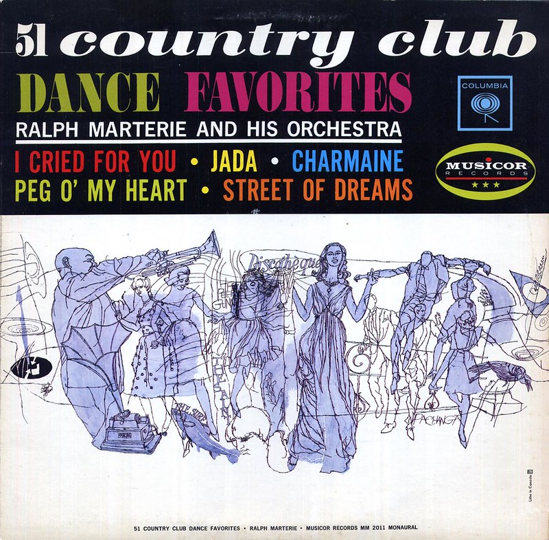
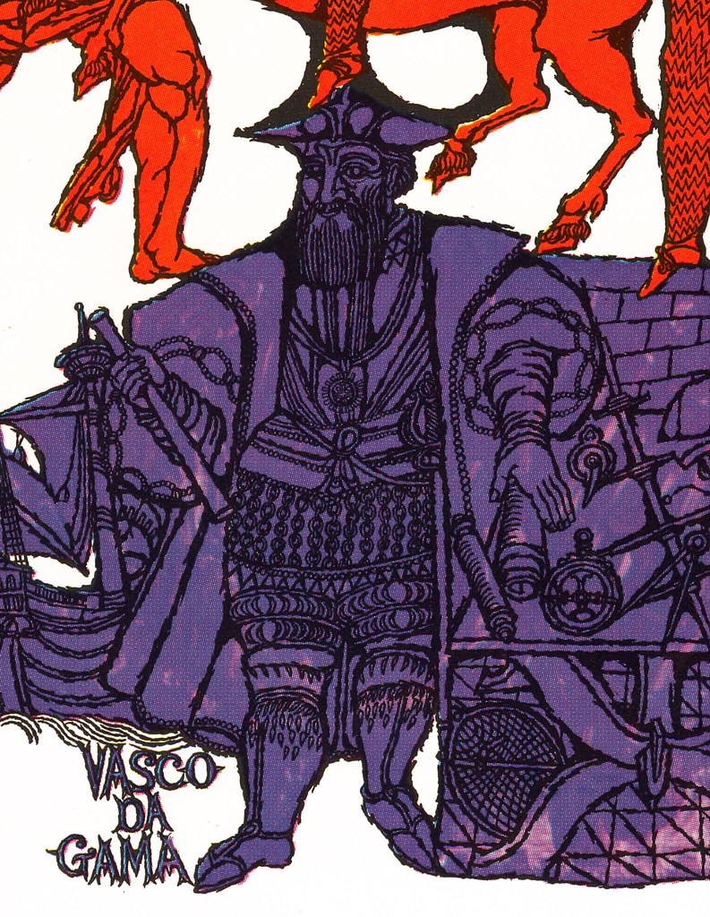
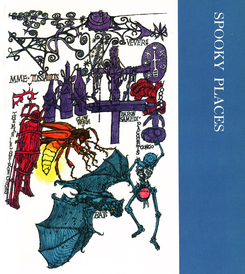
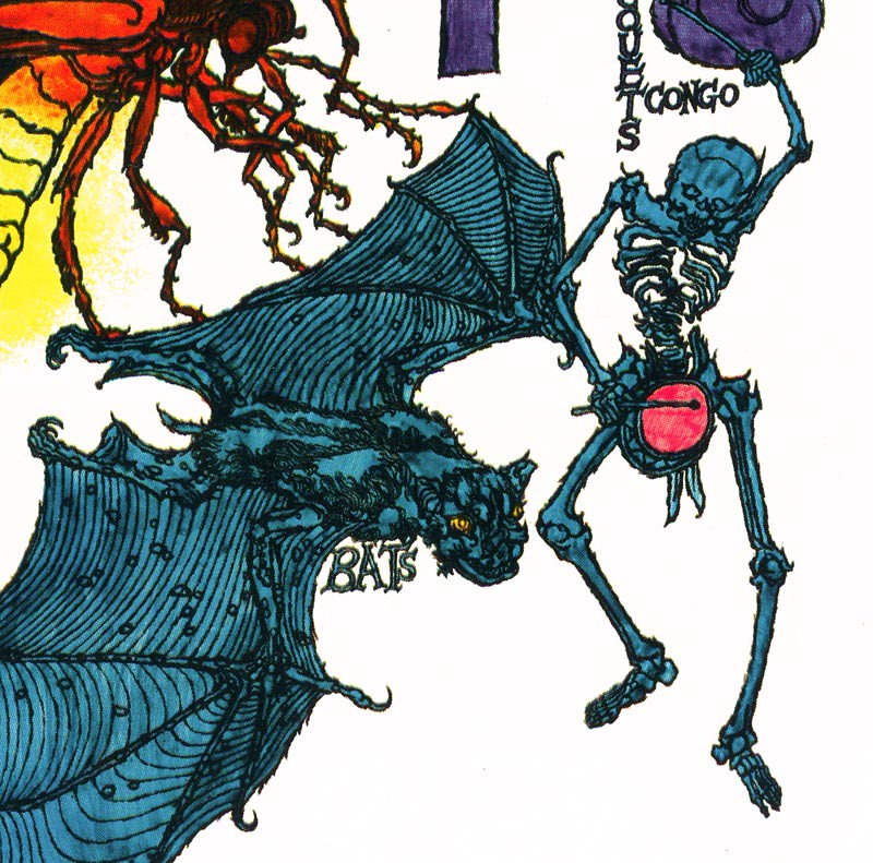
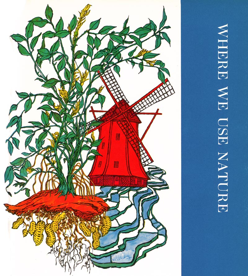
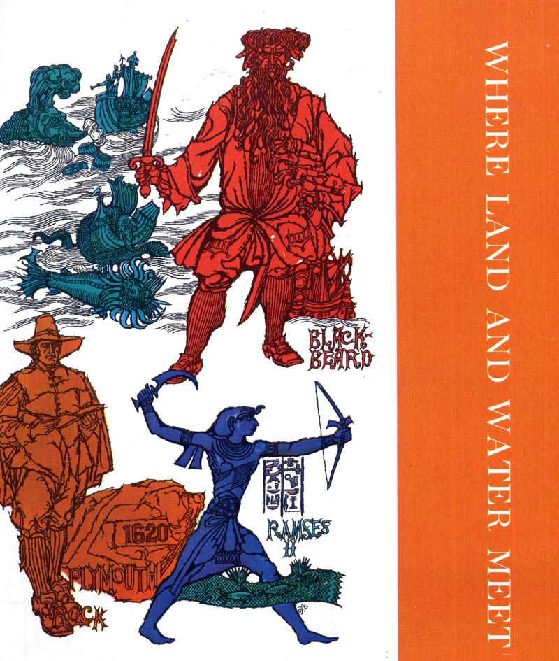
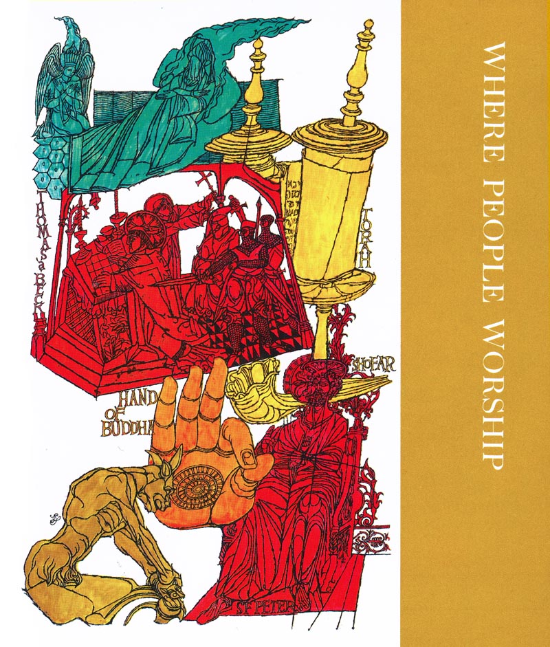
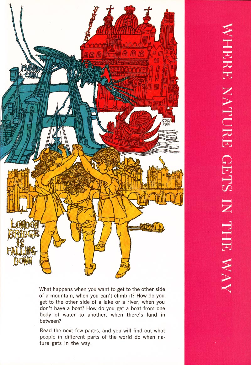
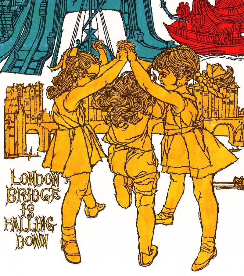
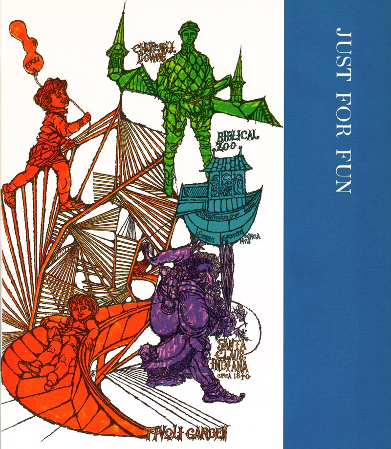
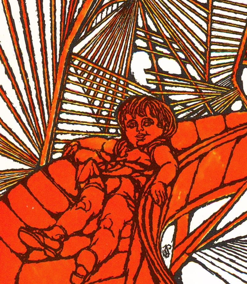
Recently I happened upon some 'new' artwork by Steffen - this time from the 1970s. Fred Steffen provided title page artwork for each chapter in Volume 10 of the 1972 edition of Childcraft, The How and Why Library.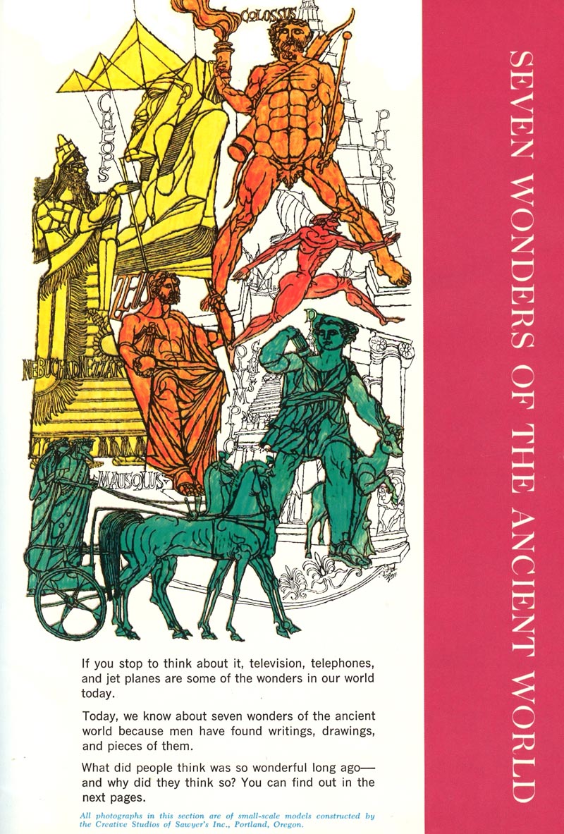
Seen at actual printed size, these illustrations are bit indecipherable. 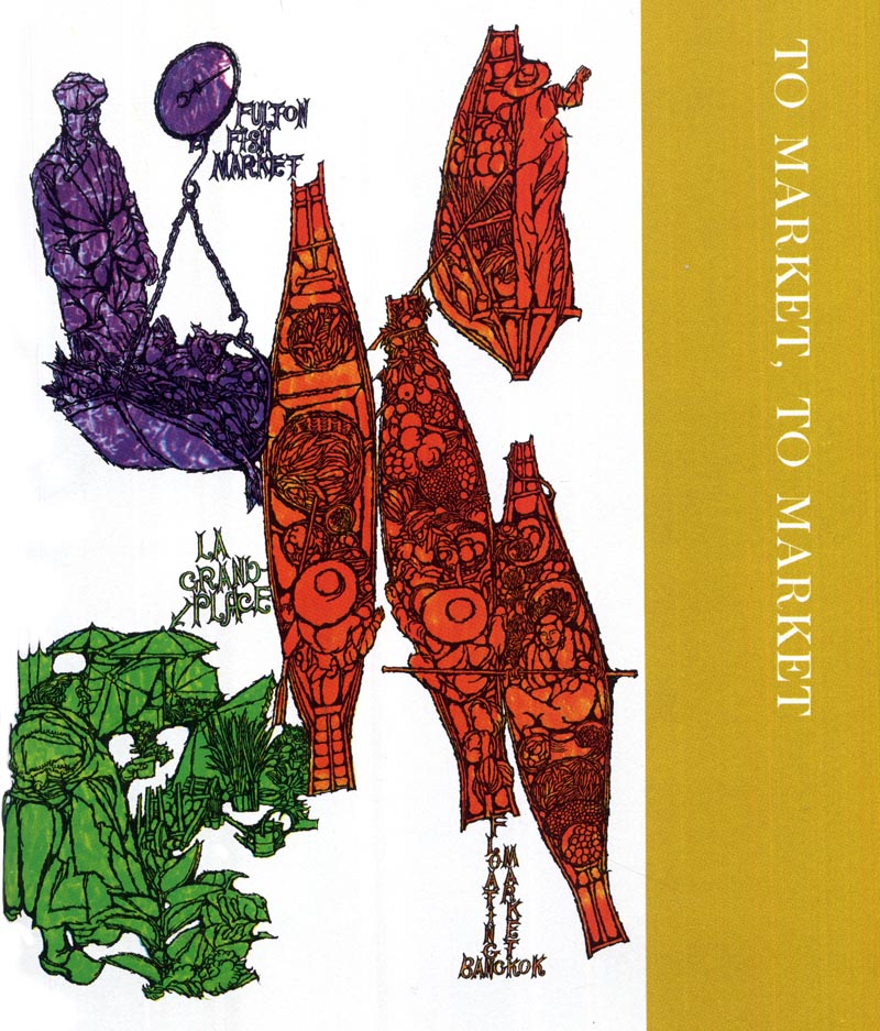
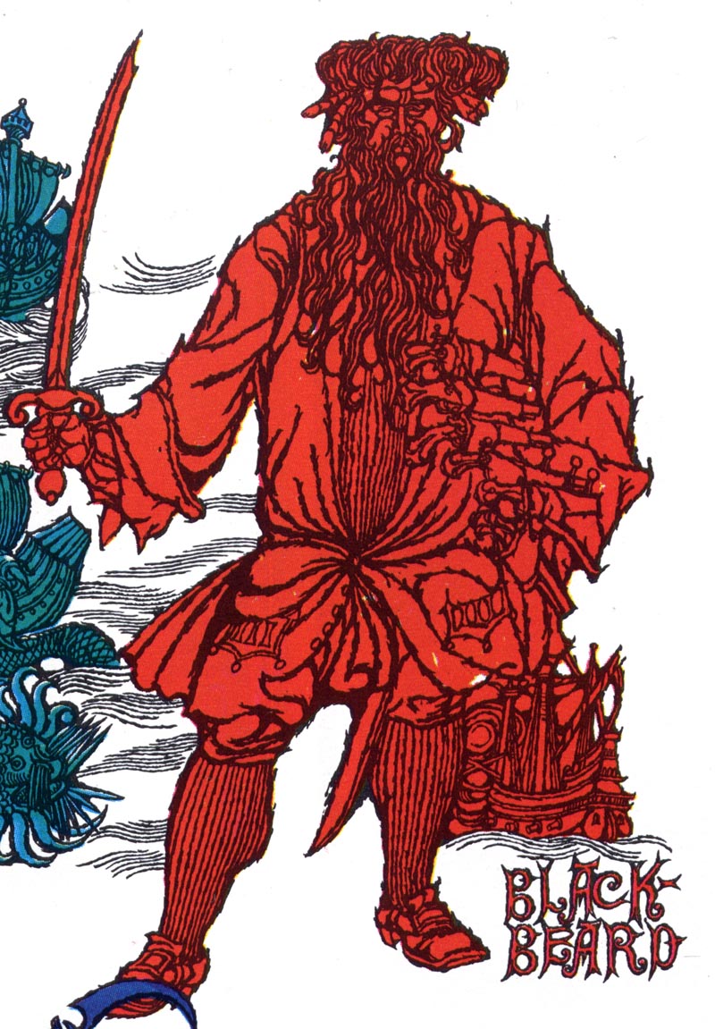
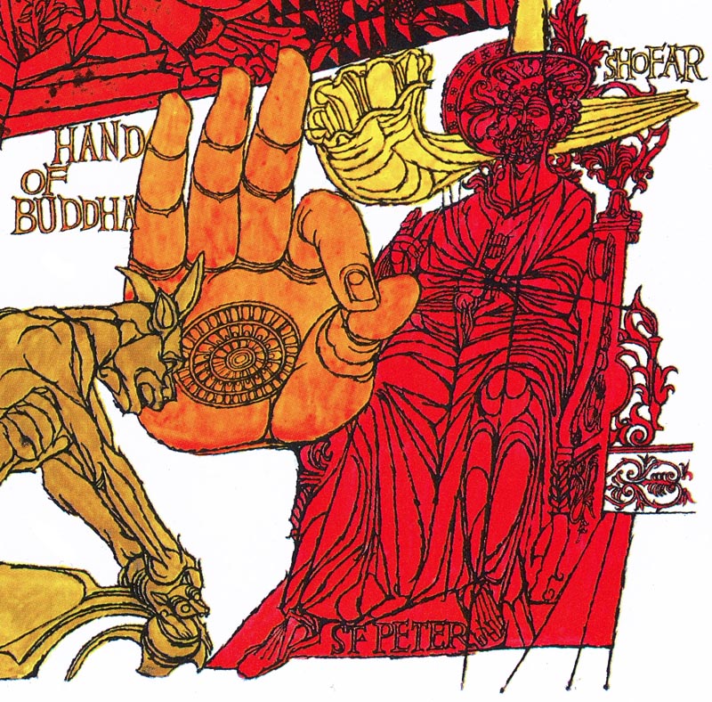
But have a look: when we zoom in on the individual elements... they're wonderful!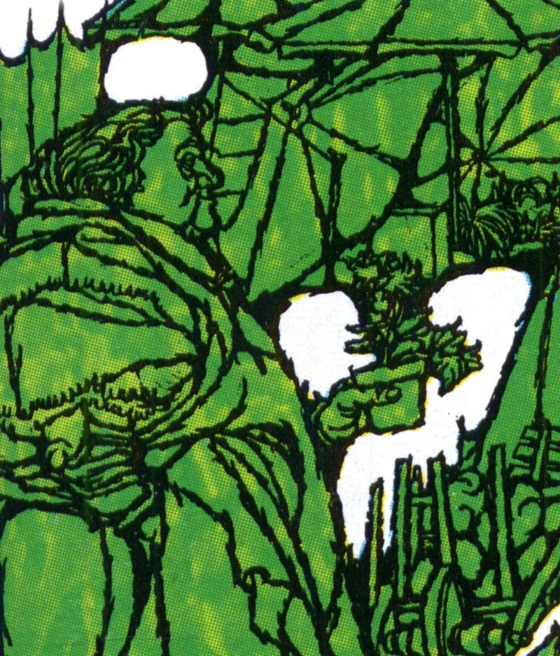
Here you can see Steffen's distinctive linear ink line style and complex but well organized use of detail.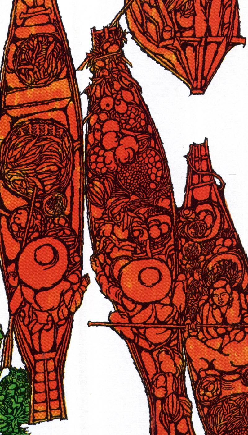
As a group, these illustrations have a trippy look so reminiscent of the era in which they were created.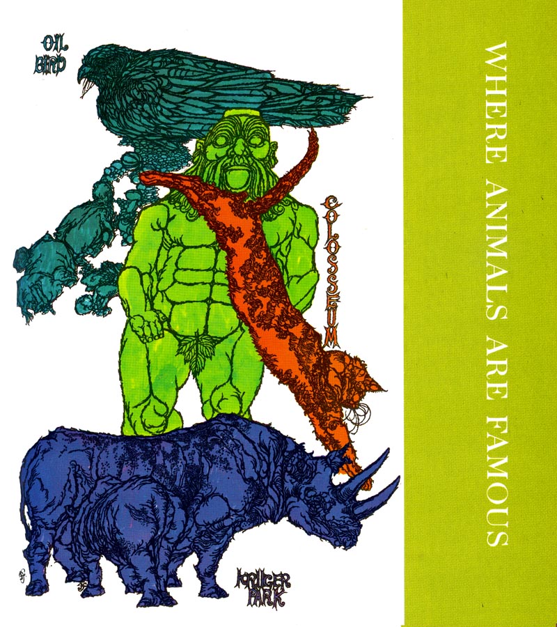
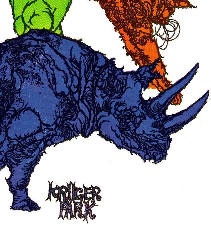
I don't really have any new information of Steffen, so I'll just leave you to scroll through this series and enjoy their groovy quirkiness.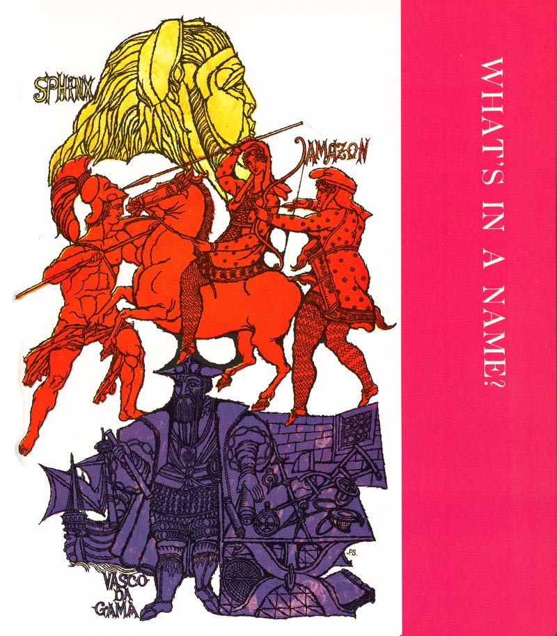


* This week, as time allows, I'll be featuring more artwork by a variety of illustrators from the 1970s editions of Childcraft, The How and Why Library.
Content taken from TodayInspiration


0 comments:
Post a Comment